Seattle Department of Transportation (SDOT)
Increasing Public Transport Usability
Team: Me!
Duration: 3 months
Role: User Researcher & Designer
Tools: Adobe Illustrator, Figma,
Scope: User Research, UX Design, Visual Communication Design
I partnered with SDOT to explore ways to improve the cohesiveness and accessibility of King County Metro and Sound Transit services. My research focused on identifying key pain points in wayfinding, navigation, and user interaction across various touchpoints.
I proposed a cohesive visual identity, more accessible directional signage, and streamlined digital interfaces for both mobile and kiosk platforms. These solutions aimed to enhance the overall user experience, promoting intuitive and inclusive use for all riders.

DESIGN QUESTION
How might we simplify and enhance the end-to-end transit experience for Seattle riders, making it more intuitive, accessible, and efficient across all touchpoints?
Background
SDOT is made up of two services: King County Metro and Sound Transit.
King County Metro operates the public bus system throughout Seattle and surrounding areas, offering a network of routes that connect neighborhoods, business districts, and transit hubs. In addition to regular bus services, Metro also provides paratransit services for people with disabilities, vanpool options, and a range of programs to promote transportation alternatives.
Sound Transit is a regional public transit system that serves the greater Puget Sound area, including Seattle, Tacoma, and Everett. It operates light rail, commuter trains, and express bus services. Sound Transit’s light rail system, known as Link, connects key areas such as downtown Seattle, Sea-Tac Airport, and the University of Washington.
Research
Within the time constraint of my three-month project timeframe, I explored the problem space by conducting informal user research to identify rider pain points and performing a UX audit of SDOT’s websites to evaluate their current design effectiveness.
These insights informed my storyboarding process to highlight the identified pain points and guided the development of design requirements to address them.
User
Research
User Research
I first conducted informal user research with student transit riders to identify issues with the current system. Via Miro board, I collected testimonials from students to get insight on the process of navigating Seattle’s public transit.
UX Audit
Storyboarding
Design
Requirements
UX Audit
Next, I conducted a UX audit of SDOT’s audience, purpose, and digital platforms. This assessment helped me evaluate the existing rider tools and identify key design requirements for my solution.


Platform presence: SDOT currently offers two separate online tools, shown above, for trip planning and transit information; but the agency lacks a dedicated mobile app. I conducted an audit of these websites to assess their ease of use and accessibility.
AUDIT RESULTS
What’s working well?
-
The Seattle transit websites provide an extensive array of information, clearly detailing various transit services, routes, and schedules. This wide breadth of content ensures that users can find relevant details on how to navigate the system, enhancing the site's usefulness for both new and frequent riders.
-
Both website feature intuitive tools like “Find a Schedule” and “Plan a Trip,” which simplify the journey-planning process. These tools offer users a straightforward, self-service experience, helping them map out routes and schedules with ease. The functionality supports real-time updates, making the tools highly valuable for time-sensitive decision-making.
-
Both websites effectively communicate available accessibility accommodations, with clearly positioned, easy-to-navigate links. The central placement of these resources ensures that users with disabilities or special needs can quickly locate relevant information, demonstrating a commitment to inclusivity and universal design principles.
What could work better?
-
Though important updates are provided online, they are not optimized for users on the move or those with limited access to technology. The absence of a dedicated mobile app and poorly mobile-optimized websites hinder accessibility for riders who need real-time information while commuting. This gap can disproportionately affect users without reliable internet access or smartphones, reducing the inclusivity of the system.
-
Riders must often rely on outdated information or word-of-mouth due to the absence of real-time updates on service disruptions, delays, or schedule changes. The websites fail to offer a seamless, up-to-the-minute view of transit conditions, leading to confusion and frustration among users, particularly during emergencies or unexpected delays.
-
Navigating the public transit system can be an intimidating experience for first-time riders. The websites do not provide a clear or user-friendly onboarding experience, leaving new users uncertain about how to plan trips, buy tickets, or understand the network. The lack of intuitive wayfinding, combined with complex routes and ticketing options, creates a steep learning curve for new or infrequent users, discouraging adoption.
Storyboarding
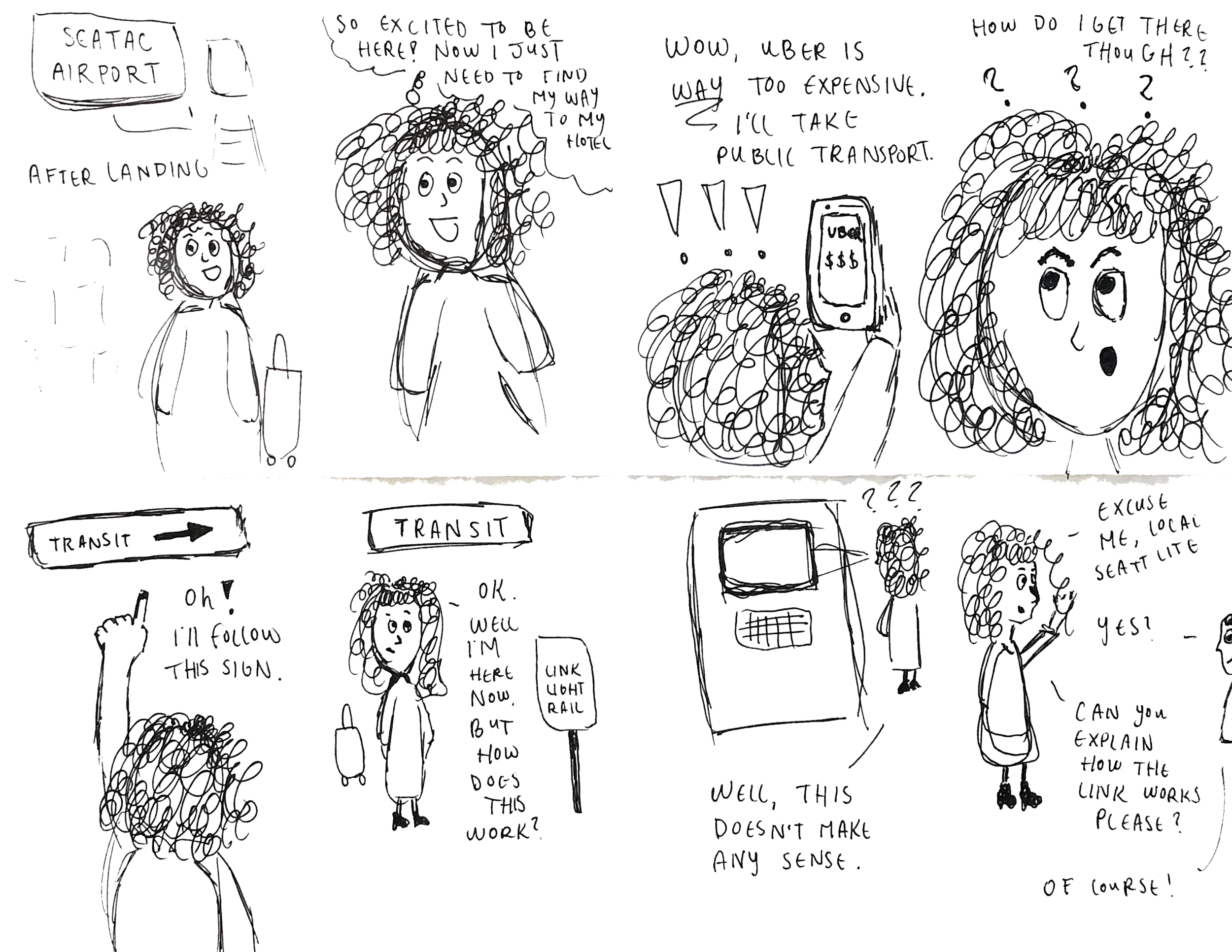
I synthesized insights from my user research and UX audit to create a storyboard, focusing on a user who is likely to encounter significant pain points during her journey: a first-time rider.
In the storyboard, the rider struggles to navigate to her destination using multiple touchpoints: her mobile device for trip planning, wayfinding signs for navigation, a ticket machine for fare purchase, and ultimately relies on word-of-mouth by asking a local for assistance in understanding how the system works.
Design Requirements
As the final step of my research phase, I defined three key design requirements to guide my solution, addressing the main challenges uncovered in my research: confusing wayfinding and limited information accessibility.
Optimized
Mobile Experience
+
Simplified
Info Architecture
+
Intuitive Spatial
Navigation + Signage
=
?
?
?
Design
With the insights gathered from my research, I transitioned into the design phase, focusing on translating user needs into actionable design solutions. I began by mapping out user flows to ensure a seamless experience. From there, I developed mockups to visualize potential solutions and iterated on them. Lastly, I created a cohesive visual system for the brand, and creating high-fidelity prototypes.
User
Flows
Mockups
Visual System
Hi-fi Prototypes
User Flows
To address the distinct needs of SDOT’s diverse user base, I created separate user flows for three key personas: Seattle locals, English-speaking tourists, and non-English-speaking tourists. Each flow mapped out the user’s journey from planning a trip to navigating the transit system, highlighting unique touchpoints for each group.
These user flows served as a foundation for developing the information architecture for my design solution, ensuring a more intuitive and accessible experience tailored to each user type.
Commuter
These users live in the Seattle area and use public transit to go to work and other places. This user already has a Sound Transit account and is familiar with how public transportation works in Seattle. Therefore, commuters have the most simple user flow.
English-speaking tourist
These users live outside of the Seattle area and are unfamiliar with the city’s public transit. This user creates a new Sound Transit account walks through on-boarding. On-boarding familiarizes the user with Sound Transit and allows them to customize travel preferences.

Non-English speaking tourist
These users live outside of the Seattle area and are also unfamiliar with how the city’s public transit works. They have the added challenge of not knowing English. The flow is identical to that of the English-speaking tourist, with the exception of the “Select Language” step.
Wireframes
Next, I began to create wireframes based on my user flows. I decided to go the lofi route and draw the screens by hand, so that I didn’t get too attached to the layouts. This step helped me explore design possibilities, yet stay open-minded to new ideas.

Visual System
Before moving onto my hifi mockups, I developed a visual system for Sound Transit. I based my decisions on friendliness and accessibility. For colors, I chose hues that represent the Seattle area: dewy grass green, Puget Sound blue, and deep salmon.

Hi-fi Prototypes
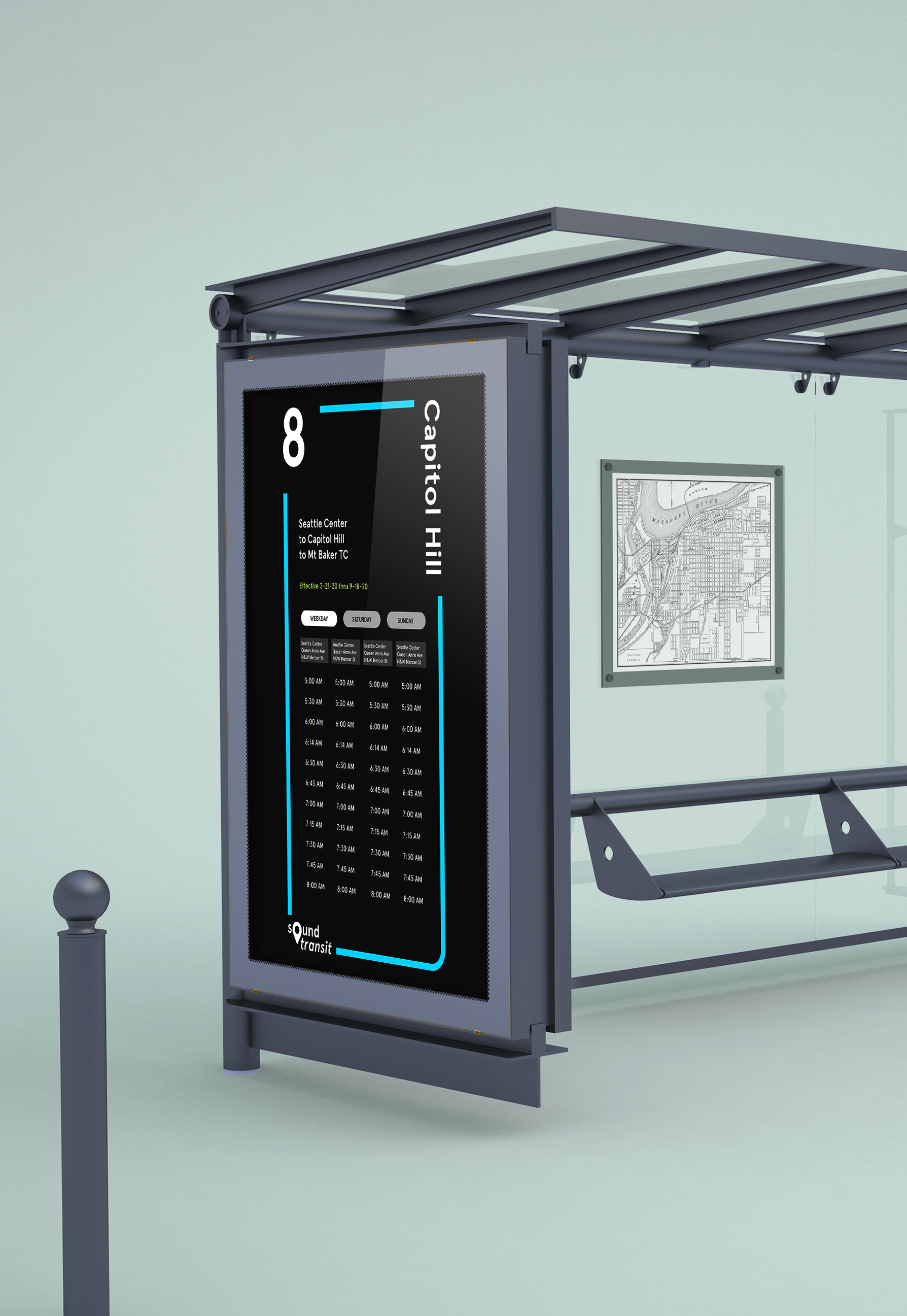
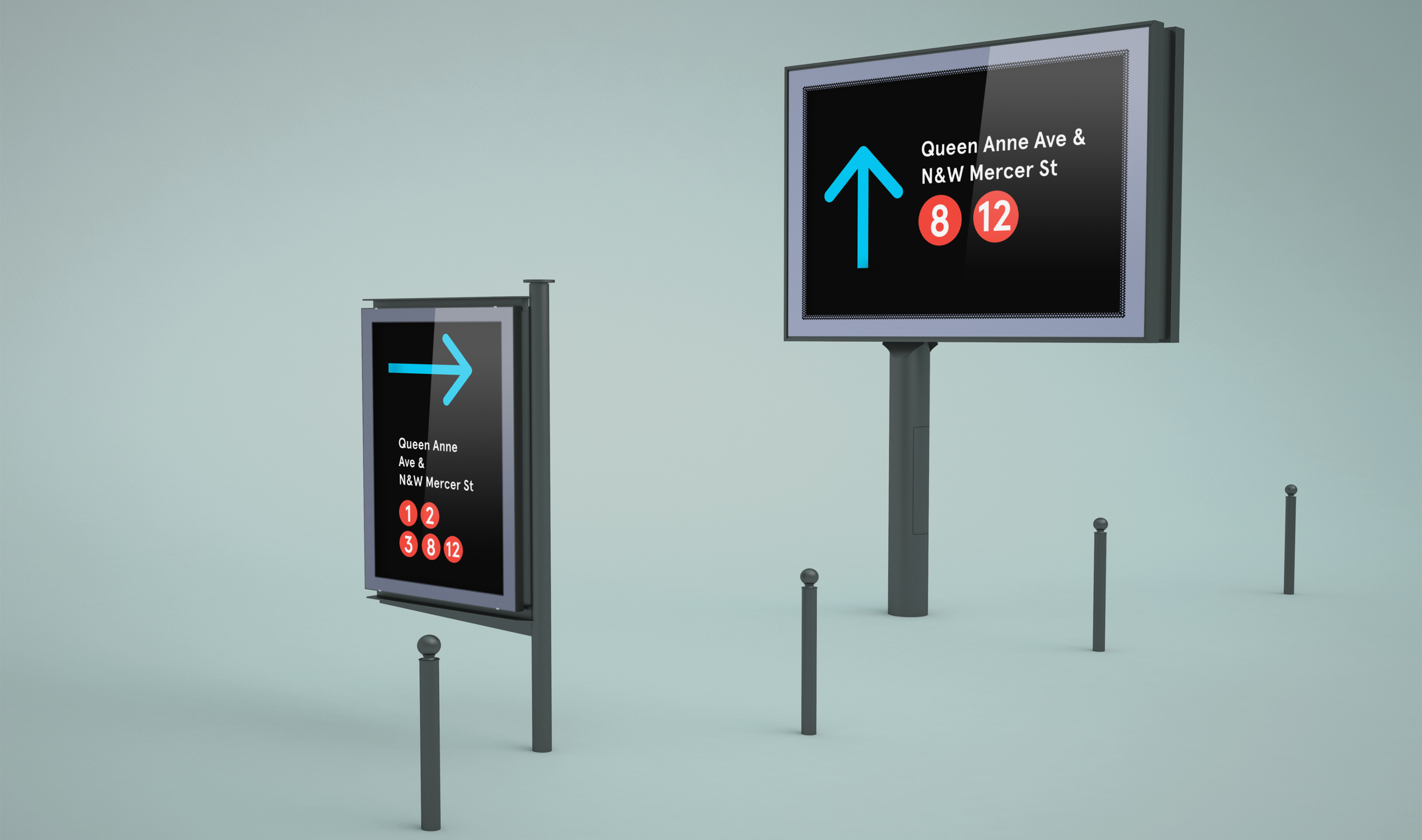
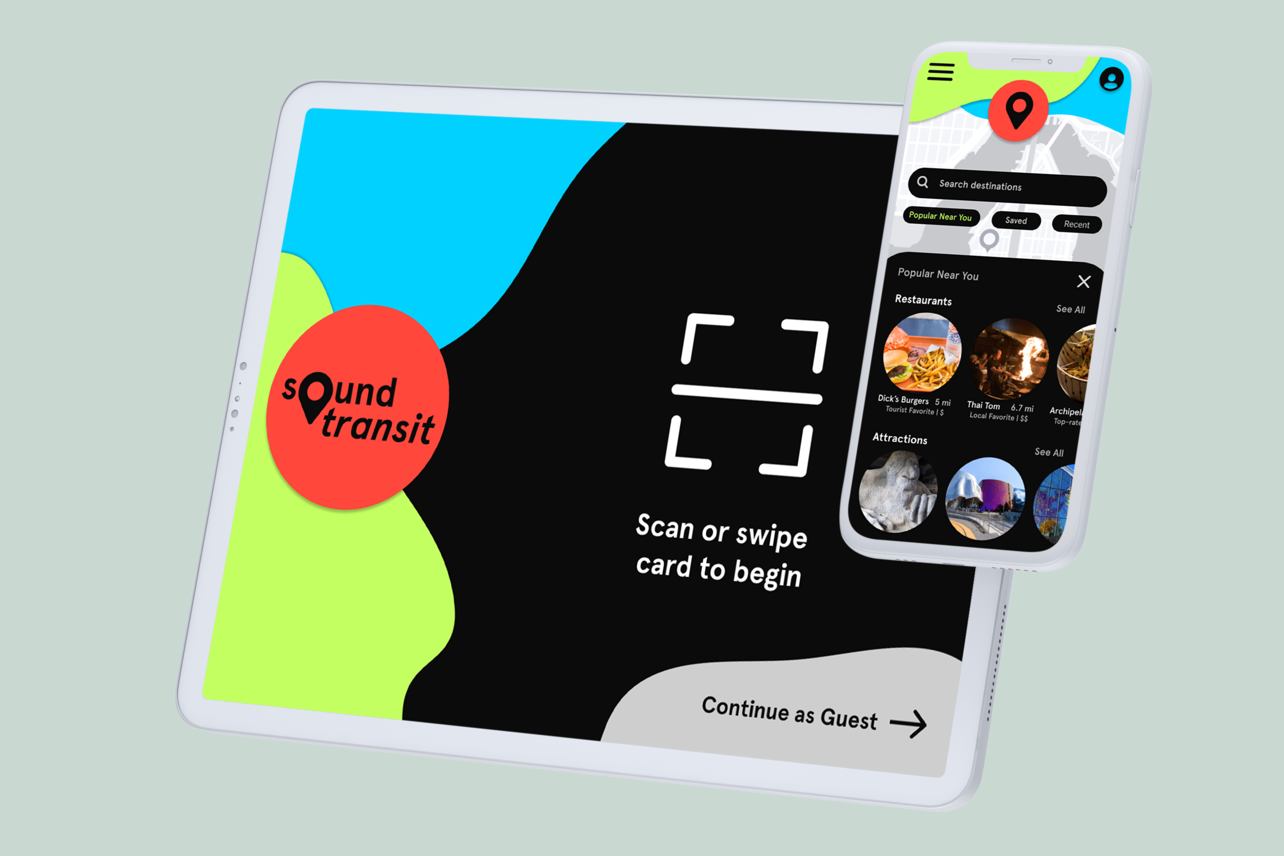
Lastly, I applied my visual system to hifi mockups. Based on peer feedback, I adjusted my wireframe layouts when designing the final screens. In addition to the mobile app + kiosk interface, I designed an interaction bus times display and directional signage.